Thursday 10 September 2009

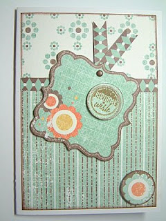
Thank You Card

I got the new Artylicious Decadent Brocade CD recently and have been printing stuff off - stupidly I forgot to take a photo of the first of the card I made but this is the second card from the CD.

The stamped sentiment is by Elusive Images and can be found on the Words of Gratitude Themeplate. The paper was inked round the edges with Memento ink and then spritzed with Gimmer Mists to make it shimmery. The Prima flowers were also spritzed with the Glimmer Mists.

Wednesday 8 July 2009

Playing with Backgrounds

This card was made for a swap that required a brayered background. The main image is a brayered resist. I stamped first with versamark using stamps by Hero Arts then brayer in the background colour and the Versamark resists the inks. I used an Adirondack Rainbow inkpad (Wild Flower) for the background.

The matting layer is also a fun background technique - I used Cut and Dry foam to blend Distress Inks (Faded Jeans, Dusty Concorde and Vintage Photo) onto some white card in a random way then spritzed this with water. Next I used a fairly wet sponge to dab on gold mica poweder from the Luminarte Polished Pigments range and then spritzed this again - this makes the Distress inks move some more and they carry the mica with them giving a lovely diffused look.

The card base is cream card which I have stamped with the same stamps as used for the main image using the Wild Flowers Adirondack Rainbow pad.

Monday 29 June 2009

Birthday Card for a Man

As well as our Wedding Anniversary, hubby also has his birthday in June, so I made this card for him.

The background was created using torn paper masks with sponges and a mixture of Adirondack dye and pigment inks. The stamps are all from Clarity Stamp except for the Birthday greeting. I enjoyed playing with my sponges and inks, trying to get a feel the rays of the sun shining down through an early morning mist. However, perhaps the thing I enjoyed most about this card was that for once I seemed to get the matting nice and straight - hubby loves to tease me when my cards are a little squint and this time he couldn't!

Tuesday 23 June 2009

About bumblebees

About bumblebees

Shared via AddThis

I don't know how aware people in general are, but our Bumble Bees are having a hard time, yet without them our gardens would not be the same, our flowers would not be pollinated and perhaps far more importantly our food crops may fail. I have been busy trying to plan a more Bumble Bee freindly garden this summer and as a result have been enjoying watching several different speices of Bumble Bee visiting the flowers. This post has a link at the top called About bumblebees which wiill take you to a web site created by the Bumble Bee Conservation Trust where you can read more about Bumble Bees and how you can help by planting your garden with flowers at the the bees like.

Thursday 18 June 2009

Faux Dichroic Glass

Well this was a fun way to spend a not so very summery afternoon - wind and rain prevented an outing that we had been planning, however my husband was intrigued by something I have been dying to try out since buying Tim Holtz' DVD "The Journey Continues". The project was to make faux dichroic glass.

It's easy enough to make if you have the tools and ingredients - we started with


Sea Glass (tumbled glass will also do, you need the roughened surfact for the UTEE to stick to)
UTEE - Clear, Black and a variety of colours made by colouring the UTEE prior to heating with with Alcohol Inks. Do NOT add the alcohol inks to hot UTEE - mix it with the cold powder and keep stirring till all the alcohol has evaporated off.
A Melt Pot
Cool Toolz to use with the Melt Pot
Craft Foil (courtesy of my friend Winspiration, owner of Foilplay)
Regular Embossing poweders - (we had some Cosmic Shimmers and some holographic
glitter ones).

To make my pices I first mixed several colours of UTEE by placing some powder into a dish, adding some Alcohol ink and stirring it. At first the powder clumps, but keep stirring and the colour will blend through to an even shade. Once it stops clumping you know the alcohol in the inks has evaporated.

Next step was to heat up the the Melt Pot and place a glass piece in it. It only takes a few seconds for the glass to heat up and then you can sprinkle a thin layer of UTEE on - once it melts use a spatula to lift the piece out and place it sticky side down on the back of some foil. Let it cool and when you lift it the foil will be stuck to the glass.

Next you place the glass foil side up back into the melt pot and start adding the coloured UTEE - you can also add little sprinkles of Metallic EP, glitter EP or stuff like the Cosmic Shimmer EPs. Once all your coloured powders are melted you then add a final top coat of the clear UTEE. With that last coat melted you lift your piece out on the spatula and lay it on a non stick craft sheet to cool.

We had a variety of foils to play with and the photos show pieces made with foil that has an oil on water effect, some self coloured blue foil, some silver foil and one piece used holographic sliver foil. The holographic foil however does not work as well as the others as the heat seems to destroy most of the holographic effect leaving it more like a plain sliver foil.

Anyhow these are the result of our playing today, the photos don't really do the pieces proper justice, but I hope you get the idea of how pretty they look. I plan to use these to decorate a photo frame when I have made enough bits, but that will require another visit to the beach to collect more sea glass! I must say an added bonus today was getting hubby involved - even tho it meant I had to take turn about with him at the melt pot!

Tuesday 16 June 2009

From One Tough Card to Another.....

Well my last post was about difficult to make cards - and here's another difficult subject - MEN!!! This is actually an Anniversary Card, but as it's for my hubby that makes it one of the dreaded "man cards" so I couldn't fall back on easy options like pretty flowers, butterflies etc. that give easy solutions for Anniversary cards being sent to other couples! Anyhow I wanted something that is romantic but in a masculine kind of way - hmmm did I just put "romantic" and "masculine" in the same sentence? Not that my hubby doesn't love me, but he just is not a fluffy hearts and kisses kind of person if you see what I mean. Anyhow this is what I came up with - manly colours with a beautiful, but not in the least bit soppy, heart stamp and text stamp, both of which are from Elusive Images.

The background for the heart was made using Distress Inks and the "Wrinkle Free" technique - one of the techniques we played with at the recent workshop I went to. The colours used were Faded Denim, Broken China and Peeled Paint spritzed very liberally with loads of water. Once this was dry I stamped and embossed a lovely leafy flourish heart which can be found on the Harlequin Rose themplate using Gold Embossing powder then spritzed it with Glimmer Mist - the colour was Sea Glass.

Finally I cut out the heart and mounted it with foam pads onto some dark blue Moondust card from Southfields - it's a gorgeous deep blue pearlescent card but the photo does not do it full justice. Before mounting the heart I had stamped and embossed in gold the word "Love" which comes from the Words of Love themeplate onto the Moondust card. This was layerd onto some gold foil card and then attached to a card blank which I had printed with a background paper design from the Artylicious Filigree Fusion CD which co-ordinates nicely with the leafy flourish design on the heart stamp.

Saturday 6 June 2009

A Sympathy Card

What can I say, these are perhaps the hardest cards we ever have to make because we want them to say so much and yet there are no words that can be said to make things better. I tried to create a mood of calm and peace - I hope I succeeded

The stamps are all from Clarity Stamp, the technique of creating reflections with a Brayer is one I learned some time ago from Clarity's very talented owner, Barbara Gray. Ink pads were all Adirondack dye based inks from Ranger - mostly Mountain Lake which is one of the now sadly discontinued Adirondack Rainbow pads. I added some of the individual colours from that are combined in the rainbow pad around the edges of the card blank -the colours were Stream and Lettuce.

Friday 29 May 2009

Tag Book Workshop

I have been away for a couple of days this week doing some workshops at Graphicus. The first one we did was a Tag book and wes more technique driven with the finished book being more a by-product of trying different techniques on tags. Anyone who is a fan of Tim Holtz will be familiar with the type of stuff we were doing - playing with Distress inks, blending them with Cut N Dry foam, adding water, etc. We also did some techniques with the Adirondack Acrylic Paint Daubers which included an image transfer - that was fun and I was pleased at how well my image came out.

When we had done we bound all our tags into a book so now we have that as useful referrence work to remind us of how to do all the techniques we tried.

I have not finished the other project we did on Thursday - that involved working with Stampbord - but I have all my stuff home with me now and plan to take the time to finish it properly over the next few days.

Thursday 14 May 2009

More Zendoodles

I decided it would be fun to try the round Zendala type of zendoodling, so I cut some circles with round nestabilities and got doodling. Next I added colour by brayering over my doodled circle using a Kaleidacolor ink pad (Caribbean Sea) which has colour bands that go from blue through to green so I though this might be acceptable for the challenge over on Colour Create this week which is to make something in Blue and Green.

I mounted the circular doodles onto some coordinating scalloped nesties that I had cut from gold foil card and then mounted these onto some light blue card. The greeting is a stamp by Elusive Images and comes from the Words of Inspiration themeplate.

Wednesday 13 May 2009

All of a Flutter

This card was made for a swap on Craft Telly forum where the monthly swap theme was All of a Flutter. The background is made in 2 halfs using a brayer, a Kaleidacolor ink pad (Melon Melody) my cuttlebug to emboss the lower half and stamps by Elusive Images to heat emboss the sparkley Dragonflys and butterflys on the top half. All the stamps for that are on the Butterfly Blush themeplate and I used Stamp N Stuff Kaleidascope EP which changes colour when heated.

The main Butterfly is from another Elusive Images theme plate, this time Just Butterflies. The image was stamped using Adirondack ink in Butterscotch, heat embossed with more of the Kaleidascope EP and then painted using Twinkling H2O paints in colours to coordinate with those in the background. This was mounted onto card cut with Nestabilites dies. The ribbon is from Maya Road.

Sunday 3 May 2009

Zen Wotsit ?

Ok so did that post title grab your attention? Then please let me explain. I was blog hopping and landed on my SBS20 sister Carol's blog where found myself fascinated by the background on one of her cards. I was thinking OK I wonder who made that stamp then cuz it's so detailed, but as I read her post I discovered that the background was not infact stamped but drawn - it's a Zentangle.

So there was me thinking OK so what exactly is a Zen-wotsit? I did what any nosey person would do - I Googled! It seems Zentangle is actually a trade marked name - and this form of art is also known as Zendoodle, or when done in the circurlar style as on Carol's Blog it is sometimes referred to as Zendala. Anyhow I had to get my black Gel Pen and have a bash and here is what I came up with.

I couldn't resist adding a little colour and as the challenge this week on My Time To Craft is "Black & White plus One" I thought I could submit the card I have made for the challenge with my attempt at Zendoodling.

Thursday 30 April 2009

Grungeboard Flowers Workshop and Assorted Thanks

Whew yesterday was a blast! I was down at Barnard Castle visiting Graphicus (my fav craft shop) to do a workshop with the lovely and very talented Lynne Robinson-Hunter. Thank you Lynne, you rock, I had a fabulous time yesterday and enjoyed getting very very inky!

So what did we do in the workshop yesterday? Well we made some absolutely gorgeous dimentional flowers with Grungboard and a selection of Elusive Images Stamps - mainly using stamps from the Big Flowers, Diamante Delights and Ruby Tuesday themplates, but a few other's crept in too. I had first seen these last year when Lynne showed me some she had been making, they looked very tricky to make, but in actual fact they are not - well maybe a little bit if you are rubish at cutting out like me - slowest in the class cuz I can't cut out at any kind of speed.


We made 2 projects, a tag with a flower which we then turned into a card and a broach. The flowers for both projects were made by first choosing some of the flower stamps in different sizes and stamping 3 of them onto Grungeboard with a permanent ink. The flowers were then cut out and coloured on both sides using Distress Inks applied with some Cut N Dry foam. With that done we flipped the flowers over and spritzed them liberally with water on the back. Next step was to leave the wet flowers for maybe 10 minutes or so to let the Grungboard soak in the water. The effect of this was to allow us to turn up the petals of each flower which we did by folding it back to the furthest point it would go then, with our thumbs, rolling it back open again. This created the curled up edges to the petals and while the Grungeboard was wet you could continue to manipulate it to get the degree of curl into each petal that you wanted. The leaves were done the same way.

With that done it was simply a case of layering up the flowers, adding some glitter, or spriting with Glimmer Mists or whatever took your fancy to embellish it some, and then mounting it onto a tag, or whatever you want to. My Broach is only 2 layers - remember what I said about being a slow cutter - I figured I had best limit myself to 2 layers as we were running out of time. The rest of the class not only managed to make 3 layers but added lovely flourishy swirls behind their broaches! I love the extra shimmer I got on my broach with the added spritz of Gimmer Mists.

Finally some more thanks to Judith from Judith @ Poppy Cottage and Sally from Crafty Salutations who have both given me an award - the "Makes my Heart Smile" Award. Thank you to both of you, I am very touched you thought of me when deciding who to pass the award on to. As this is an award that has been pased to me before I am going to skip on passing it onwards again, but if you are one of the folks who read this blog, please feel free to take it because your kinds comments always may MY heart smile. You can find the award logo in my sidebar.

Tuesday 28 April 2009

Blog Candy over the Elusive Images Design Team Blog

Glenda Waterworth of EI has 4 simply scrumptious new stamp themeplates due to launch and she is giving away some of the new stamps to 4 lucky people, so why not hop on over to the EI DT blog and take a peek - who knows, you might get lucky!

Friday 17 April 2009

Silhouette Birthday Card

This card was made for a Birthday Swap Group and now that the recipient has seen it I can post it here. The stamps are from Clarity Stamp.

The main image was stamped using dark blue Stazon ink onto some glossy card which I had first coloured with my brayer and Ranger Adirondack Inks. The Bullrushes were stamped onto some light blue card with more of the Adirondack inks. Both layers have been matted onto some silver foil card. The greeting is from a set by Woodware - the set I have shown on this blog a few time, but couldn't recall the maker - I came across them the other day in an online shop so now I know who makes them and very useful those tiny text messages are. The flower and brad are part of a kit which I bought from QVC, they are made by Paper Mania.

Thursday 16 April 2009

Orange and Yellow Challenge on Stamp TV

Having caught up with various birthday card makes I found myself with some time to play just for the fun of it. The Orange and Yellow colour challenge on Stamp TV took my fancy and this is what I came up with.

The Butterfly is by Elusive Images and comes from the Butterfly Daisy Collage Themeplate. It's stamped with Fired Brick Distress Ink onto card that I had first coloured using Mustard Seed, Dried Marigold and Spiced Marmalade Distress Inks.

The yellow background is a piece of core'dinations card stock which I embossed with a Cuttlebug embossing folder and then rubbed the surface colour off the embossed areas with an emery board. This was matted onto some orange card stock that was punched along one edge with a Fiskars border punch. The orange corners were cut using my Cuttlebug.

Thursday 9 April 2009

Apologies and a Tiddley card

I just want to say sorry to friends who's blogs I have not been visiting a lot recently. My old 'puter was getting very wobbly, dying on it's feet actually. Anyhow I had to nurse it along and avoid having it turned on for too long as it was running too hot and getting ready to fry itself. Thankfully the guys in my local computer shop are very cool guys, they kept my old 'puter running for about a year longer than I had expected and they have now built me a nice new one for not too large a number of pennies. Well not too large in the scale of 'puter stuff, but enough pennies to buy rather a lot of rubber stamps with if I hadn't needed the new 'puter.

Anyhow here is a "tiddly" card I made for a swap on Craft Telly Forum recently - the swap theme was to make a small card.. The card is what we refer to in the UK as A7 size - I know I have some American freinds who drop by occasionally so for you guys the card size is close to 1/4 of your American Letter size card which has then been folded in half to make a little card.

The whole thing was made from a piece of lovely pearlescent Moondust card - the butterfly was cut and embossed from some of the Moondust card with my Cuttlebug using one of those dies that has a matching embossing folder. I brayered some ink over the embossed butterfly using a Kaliedacolor ink pad - Calypso if I remember correctly - and finished by adding some sparkle with Stickles glitter glue.

The layer underneath the butterfly was stamped with a small text stamp which I had inked using the same Kaleidacolor pad and the daisy border at the bottom was stamped and embossed with gold EP then painted with Twinking H2Os. I can't recall who made the littel set of text stamps, but the border comes from a set made by Crafty Secrets. The other matting layer was simply another piece of the moondust card which I had coloured with the brayer in the same way as I coloured the butterfly. I did find it was best to give the ink a gentle heat set on this kind of card.

Friday 27 March 2009

New Challange Blog

Just heard about a new Challenge blog, Simon Says Challenge! The challenges start next Wednesday and there is some blog candy on offer.

Wednesday 25 March 2009

Shirley Poppys

This card came about after something I read made me Google Shirley Poppys, the flowers in this variety of Poppy are a pretty shade of pale pink. It's also another of those cards made for a March Birthday.

The stamp is from Elusive Images and is part of the Flora and Fauna Themeplate. I stamped and heat embossed it with Silver EP, then painted it with Twinkling H2Os. The greetings are also stamps by Elusive Images and were part of a Graphicus Guild Member's Limited Edition stamp plate. The frame is one stamp and there is a selection of greetings that are all made to fit inside the frame.

The image is layerd onto black card and I added some black Stickles glitter to give some more sparkle. The decorative corners were were cut from white card with my Cuttlebug and then painted with the same shade of green paint I had used on the poppy flowers. I am not sure if the end result is a good representation of the real flowers but I like to think that it's just as pretty as the photos I found in Google of the real thing.

Saturday 21 March 2009

With a Cuttlebug and a Brayer...

I finally had success with a techinique that I first read about several months ago on my friend Jan's Blog - Far North Designs. The technique was for inking Cuttlebug embossing folders before you pass them through your 'bug. My first attemps were horrible and on the odd occassions I have tried since I was still ending up with a mess. I had been applying ink to the embossing folder direct from my ink pad and things were getting just too inky. Anyhow this time I tried using my brayer to apply the ink - RESULT! I ended up playing for quite a while and created lots of lovely bits of inky embossed designs - this is the card I made with 2 of them.

Both of the embossed bits were inked using my brayer and a Kaleidacolor ink pad - Carribean Sea. The piece for the top half uses a piece of card I had already coloured with the brayer before embossing, once it had been put through the 'bug I ran the inky brayer over it again very lightly to strengthen the colours on the raised embossed areas without squishing the embossing flat again. The bottom section was simply I piece of white card which I had emobssed and then coloured with the brayer.

The rest of the card was so simple, I just chose some lovely vibrant turqoise card from my stash that toned with the colours from the ink pad. Added a little bit of ribbon and a pretty flower and brad. The tag was stamped and embossed with clear EP and then brayerd with more of the Kaleidacolour ink so it would tone in - the clear embossing provided a resist to the inks so the stamped words would show through in white.

I really like the effects I can get with this technique, you can ink first and emboss after, emboss first then ink, or you can do both, and you can apply the ink to either the raised embossed side or the indented debossed side of either your embossing folder or your card - so loads of possibilites! I think my assortment of rainbow style inkpads and brayer are going to be in for a hammering cuz this is just too much fun!

Friday 20 March 2009

Red Sky At Night

The challenge them on My Time To Craft this week is "Nature". This gave me a nudge to get a card that has been in my head for a long time - since last summer actually - made and out of my system!

The stamps are by Elusive Images and come from the Wild Meadow themeplate. Inks are from a variety of Kaleidacolor ink pads, but mainly Desert Heat and Creole Spice. The stamps were heat embossed onto the red sky background with black EP and on the main card I stamped with Versamark then dusted over with Perfect Pearls using a purple colour from the Jewel set.

The red sky background was created simply by using torn paper masks to sponge colour from the ink pads down onto the card, starting with the sponge on the edge of the mask and drawing the ink down onto my card. The colours graduated from lightest to darkest and I moved the mask a little further up with each colour. Once that was done I gently washed over this with a water brush to bleed the colours together even more.

Thursday 19 March 2009

Teddy Birthday Card

This card was made for a Birthday card swap. The person who's birthday it was loves teddies and most things cute so I dug out my one and only cute teddy stamp and came up with this. Cute is not really my forte - other people do it better than me but I enjoyed making the card.

The teddy stamp is from Visible Image and was stamped onto some card cut with a die from a set of circle shape Nestabilities then layerd onto a co-ordinating scalloped circle. The image was coloured with Prismacolor pencils which I blended with paper stumps and low odour mineral spirits.

The background paper is from the a Joanna Sheen CD - the Pamela West Collection. I stamped and heat embossed the floral corner flourish which comes from a set of stamps designed by Sheena Douglas then painted all the little leaves and flowers with with Twinkling H2Os. The flower embellishment is from Prima and was given some extra glitz with a coat of Shimmerz paint.

Monday 16 March 2009

Owl Always Love This Stamp

Yes, it's that Elusive Images owl again, sorry if I am being repetative, but I adore that stamp and it helped me out of a creative hole recently. The "hole" was the monthly swap theme on Craft Telly forum. The theme was to make a "half and half" card. Well at first I just couldn't get an idea of what to make, and then it dawned on me that it would be fun to have a go at making this card with the Wise Owl stamp.

First I cut two rectangles with my nestabilites, one in black and one in white. Next I laid the 2 rectangles on top of each other and cut them in half. The reason I did it this way was so as if my cut was not quite dead center I could match the left hand side piece from one colour with the right hand side piece from the other and still end up with a rectangle that was the same size as my orignal rectangle which would fit on the scalloped nestie layer underneath.

The next step was to join the 2 bits of card together on the back with some masking tape and then stamp the owl with versamark onto the front, postioning the owl as centrally as I could over the centre join. With that done peeled the masking tape off the back of the stamped image taking care not to smudge the versamark impression and seperated the 2 halves. This allowed me to sprinkle white and black embossing poweder over each side without any cross contamination of colour and heat emboss. Once that was done I rejoined the 2 halves and matted them onto the scalloped nestie shape which had also been cut twice in both colours and cut into 2 halves. This in turn was layerd onto 2 more pieces of black and white card which I had edged with a gold Sakura Pentouch pen.

The golden amber eyes were stamped seperately onto white card and embossed with black EP. They were painted with Twinkling H2Os then cut out and stuck down over the original image. The golden card was chosen from my stash to theme with the colour of the owls eyes and was stamped with a stamp from a Graphicus Guild limited edtion stamp using Encore gold metallic ink.

Friday 13 March 2009

Bluebell Woods for a Floral Challenge

The challenge this week on Theme Thursday is "Flowers". I love bluebells, such pretty colours and delicate flowers, so this stamp from Elusive Images is a favorite. The stamp can be found on the Snowdrop Script Themeplate.

I used green Stazon ink to stamp the image then painted it with Twinkling H2Os. This was matted onto layers of dark blue and lilac card stock from my stash. Next I made the picture of the Bluebell woods using stamps from the Elusive Images Arboretum and Wild Meadow themplates. The background was brayered using Adirondack Dye Inks then the trees and grassy bits were stamped with more of the same inks. Finally the bluebell flowers were added using a mix of stamping with the H2O paints and adding some extra spots of colour with a paint brush.

The card base is some blue card from my stash that has been spritzed with Glimmer Mists over Glimmer Screens. The Bluebell text stamp was stamped over the Glimmer mists using Azure Stazon - the shimmer of the Glimmer Mists still shows through the Stazon.

Thursday 12 March 2009

Cute Digital Images From Sandra Dry

My forum friend Sandra has just launched a new venture online. Sandra already designs stamps for the Craft Barn's Kadoodle range of stamps and now you can buy digital images designed by Sandra from her site Sandra Dry Digi Stamps. You just download the image and print it. Once the printer ink is dry you can colour it, cut it out etc - all the things you would normally do with a hand stamped image.

Wednesday 11 March 2009

Another Owl Card

This time it's for the Sunday Stampers Challege. I was ever so pleased to see the challenge involved Owls this week because after making Fab's birthday card I was itching to try stamping that Elusive Images Owl on the same brayered background, but this time with the bands of colour running horizontal to the owl and using brown ink rather than dark navy for the owl itself. Anyhow here is the card I came up with.

As before the background colours for the Owl image are from the "Country" Kaleidacolor ink pad brayerd onto white card. This time the owl was stamped with "Brushed Corduroy" Distress Ink and embossed with clear EP. The eyes were glazed with Glossy Accents and once this was dry I cut the owl out. The cream matting layer was cut with one of my Nestabilities dies and my Cuttlebug, then stamped with a little feather stamp that comes on the same Wise Owl themeplate as the Owl stamp. I used more of the Brushed Corduroy Distress ink to stamp with and then edged the layer with a gold Sakura Pentouch pen.

The card itself is some russet colour card from my stash. The ornate corner flourishes are also by Elusive Images and can be found on the Butterfly Daisy Collage themeplate. They were stamped with versamark and then I used some Perfect Pearls in Heirloom Gold to dust over them.

Monday 9 March 2009

Birthday Card for a Man

It was my dear freind Fab's birthday the other day and I know he loves this Elusive Images Owl stamp so it made it easy for me to decide on the main image for my card. The stamp is from the Wise Owl themeplate.

I started by making a brayered background using a Kaleidacolor ink pad (Country) which has bands of brown, green, blue, pink and yellow. I stamped the owl onto this using Midnight Blue Stazon. As I had chosen to stamp the owl with the colour bands of the background running vertically and had kept the stamp to the side with the brown, green and blue colours, the yellow band of colour my brayer had created was left clear. After cutting out the stamped owl I used the unstamped area of the background to stamp the owl's head again on the yellow area so I could cut out the eyes and glue them over the eyes in the orignal stamping giving the owl those wondeful amber eyes. I applied a thick coat of Glossy Accents to the eyes to make them shine. My finished owl was mounted onto some cream card that I had cut with an oval Nestability and then matted onto a scalloped oval cut from some brown Bazzill cardstock and which I had edged in gold using a Sakura Pentouch pen.

The card itself is a lovely amber yellow card from Stampin' Up which I thought picked up nicely on the colour of the owl's eyes and the pattern paper is also from Stampin' Up and was part of some lovely blog candy I won a while back from my SBS 20 sister Sam. I added a narrow strip of the same brown Bazzill to the card to create a contrasting border at the edge of the printed paper. Some very plain gold peel off corners added a finishing touch. I think think the image and the colours make this a lovely card for a man.

Wednesday 4 March 2009

Two lovely awards


I have been a bit busy just now with cards I can't post on the blog as they are for upcoming birthdays and I am not sure if the intended recipients read my blog or not. Despite that I have been priviledged to receive not one, but 2 lovely awards.

First I must thank Shirely over at Card, Art Etc for the Premio Dardos Award, and secondly Pamela over on Pamela's Pages for the Makes My Heart Smile Award. Please take time to visit these ladies blogs, Shirley has been bloging for a while and her blog is always full of the most wonderful ideas and inspiration. Pamela is a new blogger but a very enthusiastic crafter that I have known through one of the craft forums for a while.

Now the rules for the awards :

Premio Dardos

The "Premio Dardos" award acknowledges the values that every blogger shows in their effort to transmit cultural, ethical, literary, and personal values every day. The rules for this award are :
1. Post it on your blog.
2. Name of the person that has granted the award
3. Hyperlink back to his/her blog.
4. Pass the award to another 10 people worthy of this acknowledgment.
5. Contact each of them to let them to pick up the award and rules on your blog.

The "Makes My Heart Smile" award has much shorter rules - pass it on to 10 of your favorite blogs.

Now as I am required to pass on both awards to 10 others then I hope I can get away with cheating a bit and passing both awards on to the same 10 people. All the blogs below are truely deserving of both awards.

Here are my 10

1 Jan at Far North Designs for not only her amazing art work but for her interesting and informative post about life in Alaska, a severe but stunningly beautiful part of the world.

2 Fabyon (OK Fabrizio) at Cardmaking Scrapbooking and ATC: from a male point of view my wonderful Italian/Canadian/English multi-lingual friend, thank you fab, my life would be so much less fun without your friendship.

3 Anne at Stargroves - another amazing crafter who always inspires me with the diverstiy of her ideas.

4 Allison at Stampin' When I Can - I don't comment on your blog Allison, but I susbscribe to it and enjoy sharing with you the blogs you link to in your "newly discovered" posts.

5 Kath at MuckyPaws yet another crafter who amazes me with the variety of work.

6 Jo at The Little Peach Tree who does not post often but when she does you can be guarnteed to see something exquisite.

7 Stellamaris123 at Atlantic Bubble - yet another blogger who makes the most wonderful things.

8 Hels at Ink On My Fingers - love her altered art and the fun Sunday Stampers challege that I so often just don't get time to take part in.

9 Hazel at ...But is it Art? - another blogger who creates wonderful things.

10 Penny at Penny Duncan Creations - yep, another very talented crafter who make things that are lovely to look at.

Friday 27 February 2009

Moon Card

The challenge for Sunday Stampers this week was to create something with the Moon as your them. This is what I came up with.

My starting point was a stamp I have from Clarity Stamp which is a quotation from Walter de la Mare - it's hard to read in the photo but it says :

Slowly, silently now the moon
Walks the night in her silver shoon:
This way, and that she peers and sees
Silver fruit upon silver trees.


I started with a base of navy card, punched a circle of white paper for my moon and stuck it to the card. Then, using a one of the tree stamps from the Arboretum themeplate by Elusive Images I stamped and heat embossed the tree using silver EP.

I then added some silver chalk to create the impression of thin streaks of cloud across the face of the moon and also applied some of the chalk at the base of the tree to ground it. This was matted onto silver foil card then onto more of the navy card stock.

Monday 23 February 2009

A Thank You Card

This was a card I had an idea for back in January, but at the time didn't feel up to following through with the idea. The stamps are by Elusive Images, the leafy swirl is from a Graphicus Guild members limited edtion themeplate and the text is from the Words of Gratitude themeplate.

Both were stamped with green pigment ink and then embossed with clear EP. I blended Distress inks over the card stock and stamped the small thank you message over that. The clear embossing over the leafy leafy swirl resisted the blue of the distress inks.

The paper on the background is from the Artylicious Damask Delights CD and the gems were from my stash, they started as clear gems but I tinted them with Denim Alcohol ink.

Saturday 21 February 2009

A Whiter Shade of Pale

Not only one of my favorite songs, but a post title that suits this card. The card was made for a swap on Craft Telly Forum with the theme "a mostly white card".

All cardstock used is bright white card from my stash. The flowers are from a stamp by Personal Impressions. I stamped and heat embossed them onto white vellum using powders from the Cosmic Shimmer Range of embossing powders . Some of the flowers were stamped with Tropic Pearl Luster and some with Iced Blush Luster. The "Luster" Cosmic Shimmers are the very translucent powders. I used a ball tool to dry emboss onto the back of the vellum inside each of the petals to turn the vellum opaque white and then cut the flowers out. I added some translucent yellow glitter to the center of each daisy.

The matting layers were cut using a Spellbinders Nestbilites die and the larger one embossed through my Cuttlebug using the Swiss Dots folder. On the smaller layer I embossed the sentiment with more of the Iced Blush Luster. The text stamp is from Elusive Images and can be found on the Rose Script Themeplate. It's hard to see in the photo but the text says "Earth Laughs in Flowers". I swiped my Versamark ink pad round the edge of both of the layers and used more of the Cosmic Shimmers on that to give each layer an edge. Iced Blush again on the top layer and Tropic Pearl on the Swiss Dots layer.

Finally I assembled all the elements using Pinflair Gel Glue (which behaves like a Silicone Glue but without the smell) to mount the flowers. The final touch was to add a bow of pale pink organza ribbon. I was really pleased by how pretty and delicate the finished card turned out.  With a change of sentiment to something more relevant I think this would make lovely Wedding card.

Friday 20 February 2009

Pink and Brown - Meh...

...not too sure about the outcome with this one - in my head it was going to different. It was made for the challenge on My Time To Craft this week for which the theme is to us a Pink and Brown colour scheme. Lovley colours, shoulda been an easy make. Time permitting I think I may have another crack at this challenge later on.

The stamps are from a themeplate by Creative Expressions, more designs from Sheena Douglas. The inks are Distress Inks, Tattered Rose, Worn Lipstick and Vintage Photo. The sentiment stamp is by Elusive Images and was part of a Graphicus Guild limited edition stamp set. Glitter is Pink Stickles Glitter Glue.

Wednesday 18 February 2009

Another Green Snowdrop


Yesterday when I was deciding what to do for the Feeling Green challenge card I stamped the same Elusive Images Snowdrop Script stamp onto some green card, then using stipple brush added some ink to adjust the colour of the card to a more yellowy green. I painted the image with Twinkling H2Os again - and yes Jo, incase you didn't see my reply to your comment in yesterday's blog post the white paint is an H2O. It's the colour called Oyster from kit #655 and the only one in that kit that does not have an inteference colour.

Today I edged my stamped image with some green ink and dipped it into some of the pearl Cosmic Shimmer embossing powder (Tropic Pearl Lustre) and heat set it. I made a matting layer from some ivory pearlescent card and stamped a border of little snowdrop flower heads using green ink and embossed these with more of the Cosmic Shimmer EP. The little Snowdrop flower head image is from the same Themeplate as the main image.

The main card is some ivory hammer card and I have used one of the paper designs from the Artylicious Damask Delights CD as a background on it. The paper was edged with some green ink and overstamped at the bottom corner with a large flourish stamp that comes from Creative Expressions and was designed by Sheena Douglas. The flourish is also embossed with the Cosmic Shimmer EP, but it was hard to catch the shimmer in the photo.

Glad I was still in Green mode today because I can include this card in the Anything Goes Challenge on Craft Swap Forum where the current theme is "Green"

Tuesday 17 February 2009

Spring Snowdrop

The challenge this week on Daring Cardmakers is Feeling Green and challenges cardmakers to use lots of green on their card.

My card uses a stamp from Elusive Images and was stamped with Forest Green Stazon then painted with Twinkling H2O's. I edged the image with some lighter shades of green from a ColourBox Queue that has an assortment of green shades in it. I made a shimmery green background layer by blending a little more of the green inks onto some white card then spritzing with Glimmer Mists in green and yellow. The Snowdrop word stamp is from the same Snowdrop Script themeplate as the flower image and was stamped in green pigment ink then heat embossed using a clear pearl Cosmic Shimmer EP that has a green mica sparkle to it once heat set.

Thursday 12 February 2009

Another January Rose

I was in the mood to get on with my half-attempts at crafting that have been lying around since January. This card was made from things I had been playing around with in a plum and gold theme. It's the same stamp, the Elusive Images Harelquin Rose.

This time I have created a background in the plum and gold tones using Adirondack Alcohol Inks. The colours were Wild Plum, Cranberry, Raisin and a little of the Gold Metallic Mixative. Onto this background I stamped and heat embossed the rose using White EP and edged the piece with a gold Sakura Pentouch Pen. This was mounted onto white card stock and then onto another piece of card that had been coloured with the same Alchohol Inks and edged with the same gold pen. These were then mounted on to some plum colour Bazzil card stock. The Bazzil looks a bit bumpy on the folded spine of the card and this seems to have been emphasised in the photo to the point where it almost looks torn, I may have to think about remounting this onto something else.

Wednesday 11 February 2009

Better Late Than Never

As the challenge this week on My Time To Craft is "Going for Gold" I decided that I really should take that as a sign that I needed to finish a card I had started making in January, it was originally meant to be for "Plum and Gold" for the challenge on the Graphicus Team Blog, but as I have mentioned January was a bit of a nightmare. Anyhow here is my "Going for Gold" (with Plum) card.

The stamp is by Elusive Images and can be found on the Harlequin Rose Themeplate. It was stamped and embossed with Gold EP onto black card first. I then bleached out the card where I wanted to paint the rose and used Twinkling H2Os to paint the flower and leaves. This was matted onto some plum colour Bazzil card and then onto gold mirror card.

The main card is black card which I have partly covered with paper printed from the Artylicious Damask Delights CD. A narrow gold peel off border was added to the edge where the paper joins the card. Finally this was spritzed with Silver Bells Glimmer Mists to give both the printed paper and the blank card a lovely shimmer.

Monday 9 February 2009

Birthday Card for a friend

First I should say sorry to all my lovely blogging friends who have been wondering where I have been. I had to have some dental treatment in January which included having some teeth out. It's been a nightmare, pain from the extractions, pain from infections and sockets that just didn't want to heal. All of which lead to the dentist doing more stuff that left me once again feeling like I had been belted in the face with a cricket bat and no craft mojo at all! Anyhow things seem to be on the mend now and I am hoping my mojo is back cuz I have a few projects on the go just now.

A friend had a birthday recently. He and his partner make lovely cards so I tried to make something in a style I hoped he would like. Not my usual style so I am never very sure if my efforts at this kind of card are that good, but I enjoyed making the card and love how crisp and fresh the colours in these papers look. The papers are by ScribbleScrabble and the stamp is from an HOTP set that came in a QVC TSV.

Sunday 8 February 2009

New Collage Themeplates from Elusive Images and Blog Candy

The new Butterfly Collage Themeplates have been revealed over on the Elusive Images Design Team blog..... yummy! And even more yummy - there is blog candy up for grabs to celebrate the launch of the new stamps so why not pay the EIDT blog a visit!

Tuesday 6 January 2009

Fab's Christmas Challenge is Back!

Last year my freind Fab ran his Big Christmas challenge all year and joining in as many challenges as I could certainly helped me to have a stock of cards ready for Christmas just past. If like me you have made a resolution to be ready in plenty of time for Christmas 2009 then why not visit Fab's new for 2009 Christmas Challenge blog and join in this year - there is a link on the right hand side of my blog right at the top where you can't miss it - just roll over that and click or click the link in this post. I certainly plan to join in again this year and here is my first card - well 2 actually! As the colour scheme is Red and Green and the whole card is based around a the stamped greeting these also fit the terms of the current challenge over on Christmas Cards All Year Round - a twofer!

The stamp is from The Artistic Stamper and was stamped and heat embossed onto ivory pearlescent Moondust card using Green Sparkle EP on one card and Red Sparkle EP on the other. I painted in the text using gold Twinkling H2Os. These were then mounted onto foil card, using red foil card with the Green embossed stamped greeting and green foil card with the red embossed stamped greeting. I chose red card to mount these onto. For one I used a small left over piece of paper I had printed from the Artylicious Season's Greetings CD, and for the other I used Versamark and Perfect Pearls to create a background using the same stamp. I think the one with the printed paper background is my favorite, but both were really quite quick cards to make.

Monday 5 January 2009

There's a moose loose aboot this hoose...

... um sorry, my Scottish genes were getting a bit carried away there! I have always rather liked the House Mouse stamps, such cute characters! I think this is such a sweet image of the little mice taking a shower under the spout of a watering can. This is a card I made for someone's birthday and as it has now been received I can post a piccy here.

The image was stamped with black Stazon because I planned to use a wet medium to colour the image. Once stamped I used Derwent Inktense Pencils to colour the image, these pencils are cool because unlike normal water colour pencils they dry permanent. You can use them like a regular watercolour while wet but once they are dry you don't have to worry about the colour bleeding if you want to add other wet stuff such as clear glaze or glitter glues. I did infact add some clear glaze from a Sakura Gelly Roll Glaze pen to the water coming from the spout of the watering can and to the puddle that has form around the feet of the mice to give it a shiney wet look. For some reason the photograph is not showing very clearly that there is a weak wash of blue over the puddle and this was the colour I did not want to have bleed into other areas.

The background paper was made using the 3D2 Card builder CD and Joanna Sheen's Pamela West Collection CD. On the Joanna Sheen CD there was a lovely image of some blackberries, but unfortunately the co-ordinating paper did not incorporate any of the berries so I used a graphics programme to cut a tile of the image out that did include the berries and some leaves. Then using the 3D2 CD I created my own a backing paper. I need to play some more with the 3D2 CD however as I could not figure out how to make the tile big enough that you can actually see the blackberries repeated across the page and I was running out of time to get my card into the mail, so I went with what I had made as the colours were just perfect to match those I had used when colouring the stamped image.

Sunday 4 January 2009

Easy Elegance and a Thank You

The challenge theme on My Time To Craft this week is "Easy Elegance" My interpretation of that is something elegant but simple to make - a nice way to ease back into making something after the rush of Christmas crafting! So my card is just one stamp, one ink pad, a gold pen and a few peel-offs - couldn't be simpler.

The stamp is from Clarity Stamp and one I have been lusting after for a long time! I finally treated myself to it and a couple of others at the NEC in November and this is it's first outing. I stamped the image using Tim Holtz' Distress Ink in Aged Mahogany then, using a water brush, pulled in colour from the stamped image. Using the same ink pad and Judikins Color Duster I stippled some of the ink round about the image to soften the background and added the gold edge with a Sakura Pentouch pen.

The image was mounted on some Basill cardstock and then onto white linen finish card. The greeting and corners are peel-offs.

I also need to say thank you to Smullis for passing on to me a Kreativ Blogger award - it's in my side bar. As I had received this award previously I hope I can be excused from passing it on again as I think most of the blogs I love to visit already have this one. Please take time to visit Smullis blog Dragonfly Dreams, she has some lovely work to share. Oh, and incase like me, you find yourself wondering what "letterboxing" is then you may find this wikipedia link useful.

Friday 2 January 2009

Christmas Left Overs - Not More Turkey!


In the final run up to Christmas I made some cards using Joanna Sheen's Enchanted Christmas CD. As I was in a hurry at the last minute I didn't mess about printing only the bits I wanted, so this left me with some pages of partly used toppers and bits and bobs of co-ordinated backing papers piling up in my craft room. It seemed like a good idea to use them up and get a head start on my cards for 2009. In fact I have promised myself faithfully that for Christmas 2009 I will be ready with plenty of cards made well before any deadlines for mailing them out come around. That way it won't matter if my mojo does it's now annual trick of heading off to warmer climes for a December vacation leaving me stuck at home with no creativity! Anyhow here are a couple of cards made with my "leftovers".

For the first card I simply added red and green Stickles Glitter glue to the Poinsettia and also traced the sentiment with gold Stickles. The image and the co-ordinating backing papers were matted and layered onto gold foil card and I added a pretty bow as a finishing touch.

For the second I matted and layerd the image and backing paper onto dark blue card and, using my favorite Stardust Stickles, added lots of sparkle to the snowy scene in the main image and traced a fine line of glitter round the edges of the mats. The sentiment is a silver peel-off sticker. I still have more unused bits - seems a shame to waste them so if I find I am still in Christmas mode I may put together a few more cards in the next few days.